Interactive Example
When operations take one second or longer to complete, add a Progress feedback element to your design.
Usage/Design Guidelines
Determinate Progress Bar
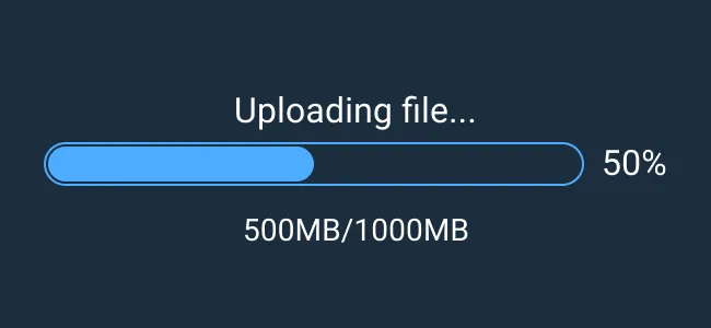
A determinate progress indicator is displayed as a linear bar that dynamically fills in as the process gets closer to done. Specific percentages, amounts, or time can be indicated in surrounding text for more detailed progress reports. This type is recommended for processes longer than 10 seconds or when the duration of a process is known. There are 3 variants provided for the 3 percentage increments. Inside the layers, the label text can be toggled off and on to show or hide on any variant.
Indeterminate Progress Bar
An indeterminate progress indicator is displayed as a continuously spinning circle with no strict percentage or timeframe labeled. This type of indicator is usually used when a process takes between 1 to 10 seconds unless the duration is known. The progress text layer can be hidden and shown in the layers menu.
Rules of Thumb
- Use Indeterminate Progress mode to continually display unknown progress for an operation.
- Use Determinate Progress mode when an operation has a well-defined duration or a predictable end.
- Don’t provide inaccurate time or percentage estimates if the precise completion time for the operation is unknown.
Appearance and Behavior
An Indeterminate Progress indicator is displayed as a continuously spinning circle with no strict percentage or timeframe labeled. This type of indicator is usually used when a process takes between 1 to 10 seconds unless the duration is known.
A Determinate Progress indicator is displayed as a linear bar that dynamically fills in as the process gets closer to done. Specific percentages, amounts, or time can be indicated in surrounding text for more detailed progress reports. This type is recommended for processes longer than 10 seconds or when the duration of a process is known.
Examples


Asset Status
| Asset | Version | Status |
|---|---|---|
| Documentation | N/A | Available |
| UI Kit - Dark | v7 | Available |
| UI Kit - Light | v7 | Available |
| UI Kit - Wireframe | v7 | Available |
| Web Component | v7 | Available |
| Component Tokens | N/A | Planned |